Aug–Dec 2025 production · Oct 2025–Jan 2026 giving
01The problem
One appeal, two very different donors
The appeal had always leaned on an older donor base, so the printed mailer took the front seat. In 2025, growing a younger donor base became a goal, which meant digital could no longer be an afterthought.
A younger donor expects a modern page and a quick way to give. A longtime donor holding the mailer should recognize the same campaign when they scan the QR code. Pick a donor, then step through their week.
As project manager, I pulled donor data from GoFundMe Pro and our Salesforce CRM with the fundraising and development teams, shaped it into one story, and turned that into direction a creative team could act on. Every channel then pointed to a single place to give.
Open each step · pick a channel to follow it
05 · Destination
One landing page, one place to give
$0K
0 gifts
03The blueprint
A long page with two chances to give
This is the wireframe I planned the donate page from. Each numbered section had a job. Press a number to read what it was for, then try the feature it became.
Press any number
04The system
Every color has one job
The same palette ran through the mailer and the page. Navy anchors trust, orange carries emphasis, and black is saved for the donate button so it always stands out.
Pick a color to see where it works
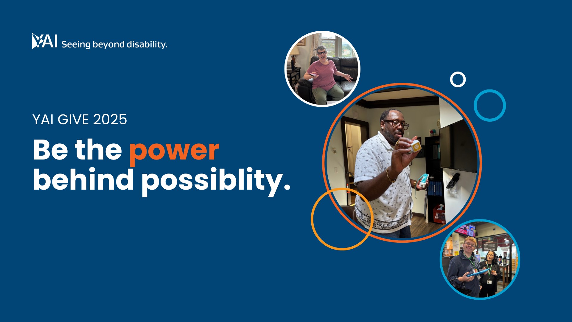
Give 2025
Be the power behind possibility
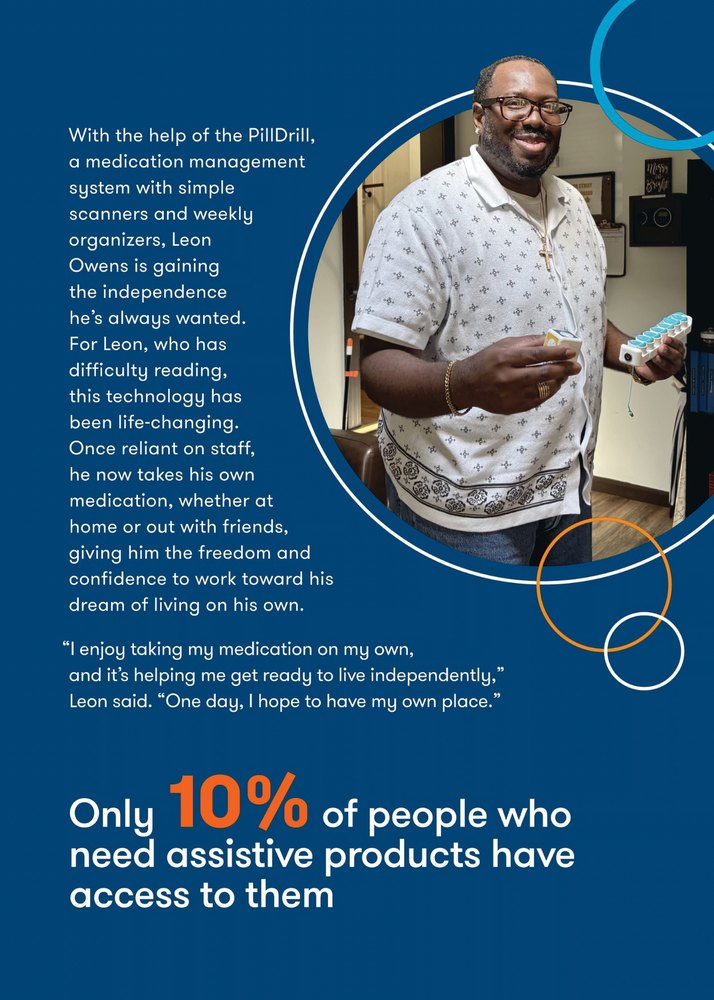
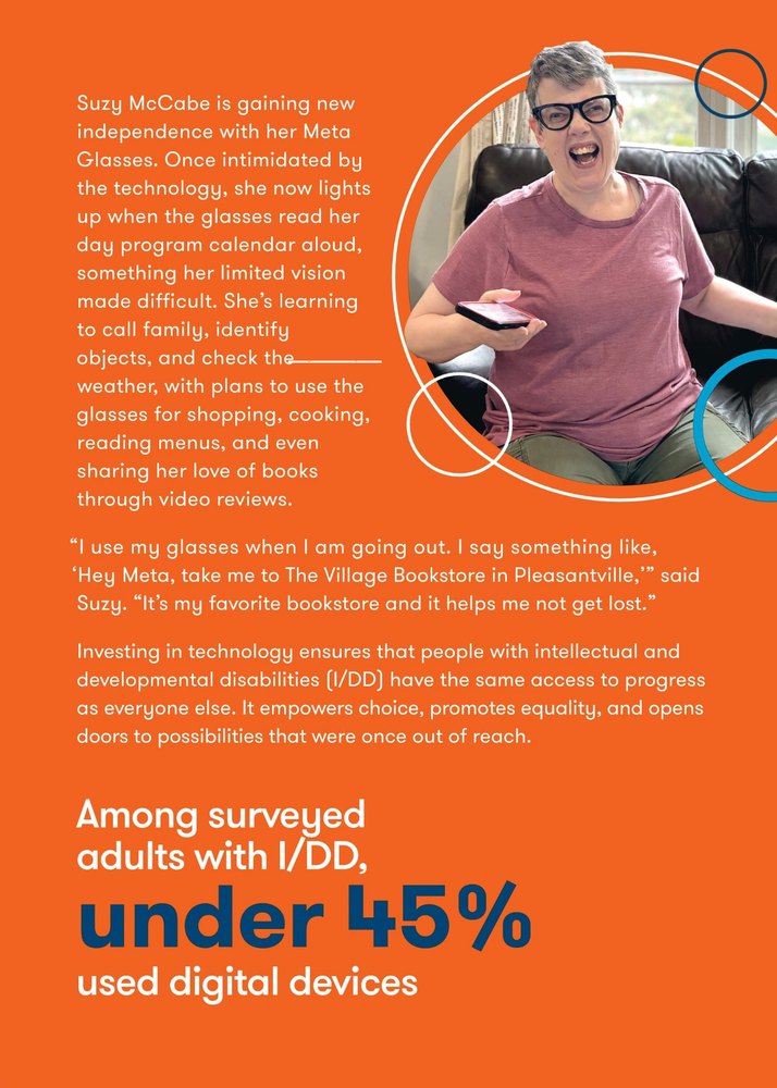
Navigating Life with Meta Glasses
“Hey Meta, take me to The Village Bookstore in Pleasantville.”
Building Confidence with Visual Supports
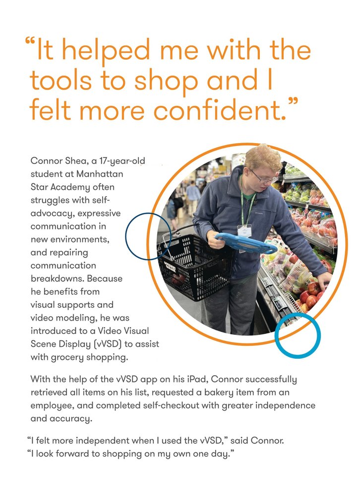
“It helped me with the tools to shop and I felt more confident.”
Donate
Navy anchors trust. Orange carries emphasis (“Be the power”), the progress bar, and story bands. Black is reserved for the donate action, so it always stands out.
05Print to screen
Open the mailer
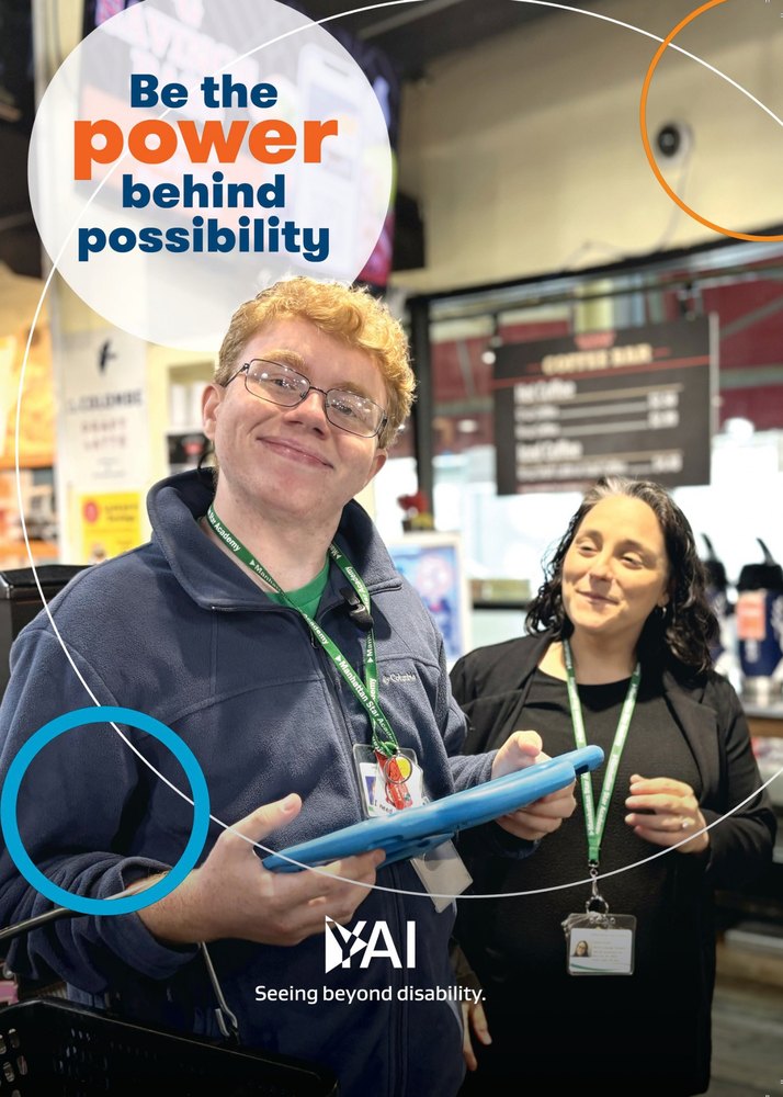
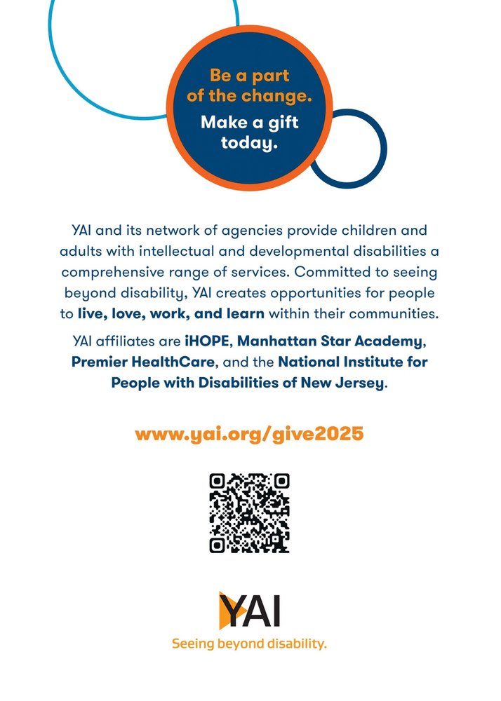
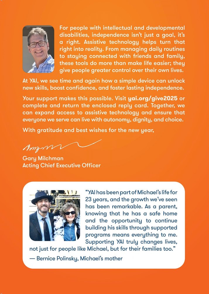
For longtime donors, the printed trifold was the front door. Unfold it, flip it over, then compare it with the page: same people, same circle crops, same rings, same line, so each piece reinforces the last instead of competing with it.
Unfold it
The appeal arrives folded, with Connor on the cover.
Same story, print to screenPick a pair
PrintWeb
The same headline, the same people, and the same ring motif open both the mailer and the campaign’s digital key visual.
06The impact
What the appeal raised
Campaign-wide results from a team effort across print and digital, October 2025 to January 2026, plus a first look at who gave.
$0K
Raised toward a $300K goal
+0.0%
2024
$251K
2025
$270K
Year over year
Back to 01 · younger donors
0.0%
16.4% of donors were young donors, in the 30–39 age bracket or younger. There's still a ways to go in reaching younger donors, but it's a first baseline to build from.
39 or younger40 and older · each square is 1% of donors
0
Gifts across print and digital. Each dot is one gift.
07What's next
Keep building the younger donor base
16.4% of donors being 39 or younger is a start, not the finish line. Next time I'd track first-time online donors, and gifts through the page versus the reply card, from day one, to see which channel brings younger donors in and keep investing there.