Print, Signage & Graphic Design
The offline half of the work, led by a hat: a sun drawn by an artist with I/DD, brought to life as merchandise and worn across Central Park.
YAI exists to support people with intellectual and developmental disabilities, so the strongest design move is often to step back and let their work lead. The sun hat does exactly that. The rest of the pieces apply the same thinking as the websites: know who's looking, give them one clear thing to do, and keep everything in the same visual language.
The sun hat
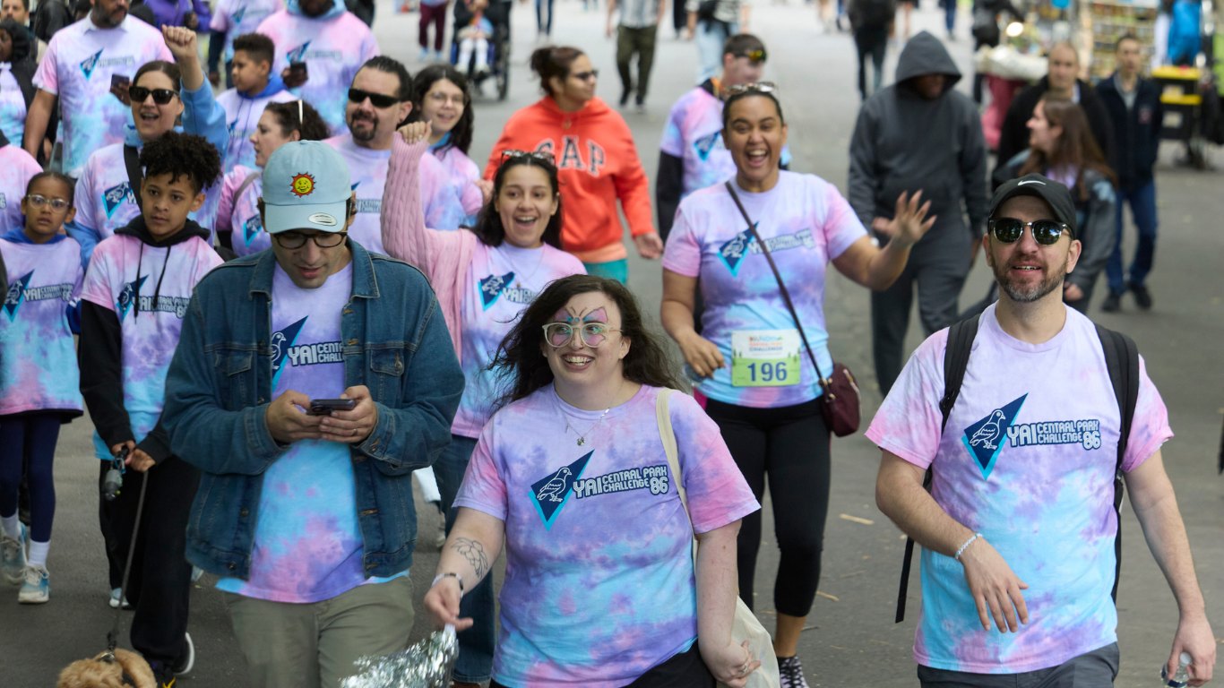
Central Park Challenge · 2023People with I/DD are too often overlooked. In my time at YAI, I've seen so much talent go unnoticed simply because someone is neurodiverse or communicates differently. This sun was drawn by an artist with I/DD from YAI Arts, YAI's studio for neurodiverse artists, and the hat was a way to put that talent on display. It was always there; I just helped bring it into the spotlight, keeping his linework, adding color from the event palette, and adapting it for embroidery. To produce the hats, I worked with Spectrum Designs, a custom apparel company that employs people with autism and shares our mission of building more inclusive spaces, so the hat was made by our community as well as for it. Worn across Central Park by participants, it put his art on the heads of the people who came to celebrate his community.
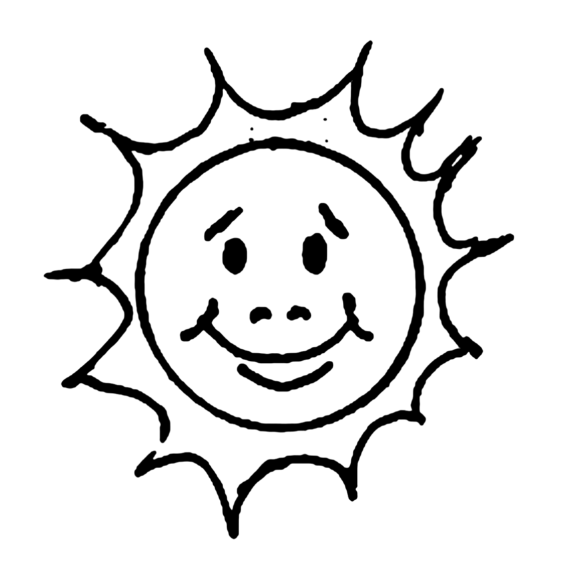
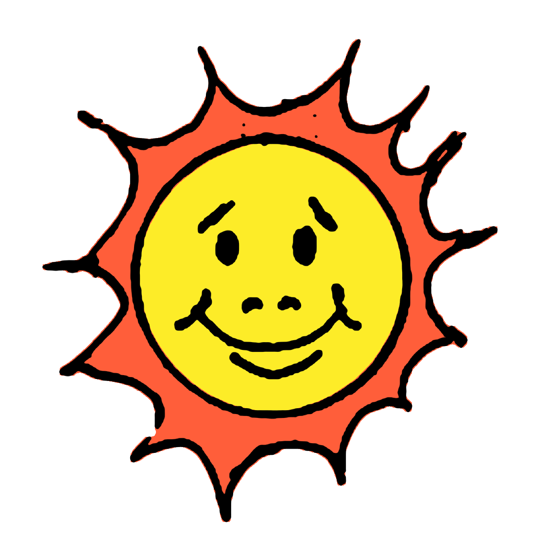
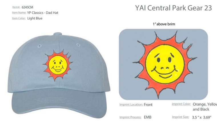
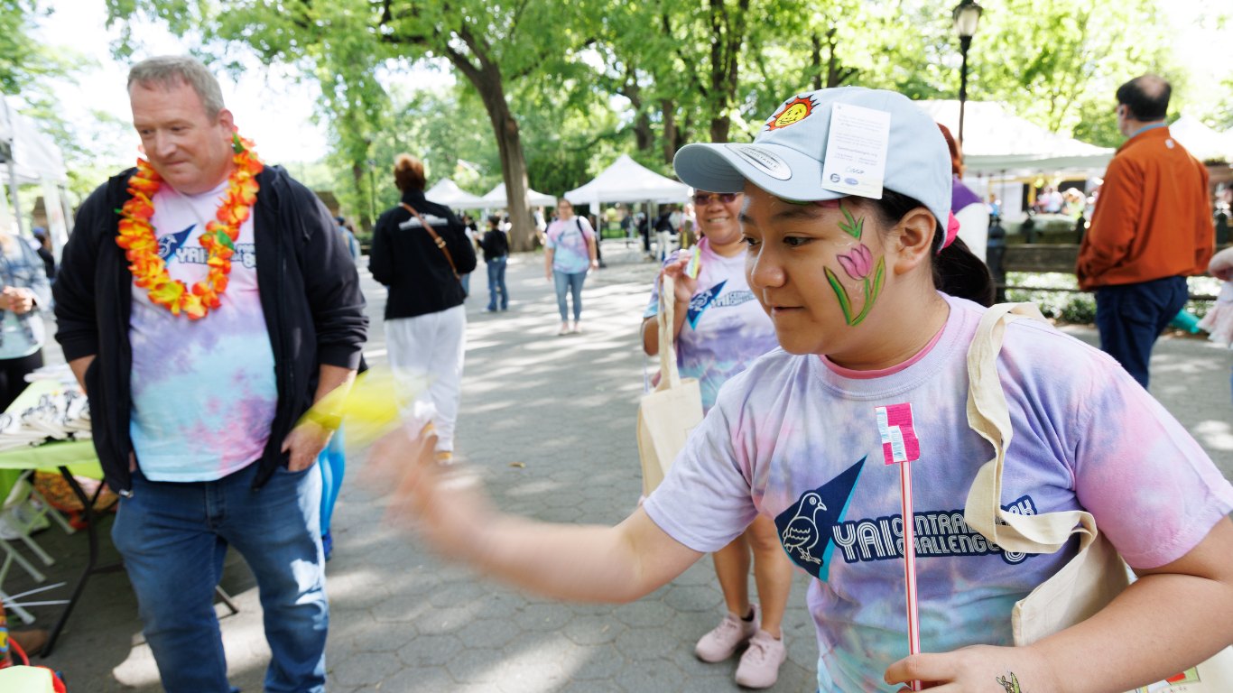
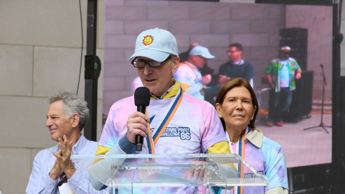
Drawn by hand by an artist with I/DD from YAI Arts, YAI’s studio for neurodiverse artists. Everything that makes the sun charming, the wobbly rays, the raised brows, the double smile, is his.
Poster & wayfinding
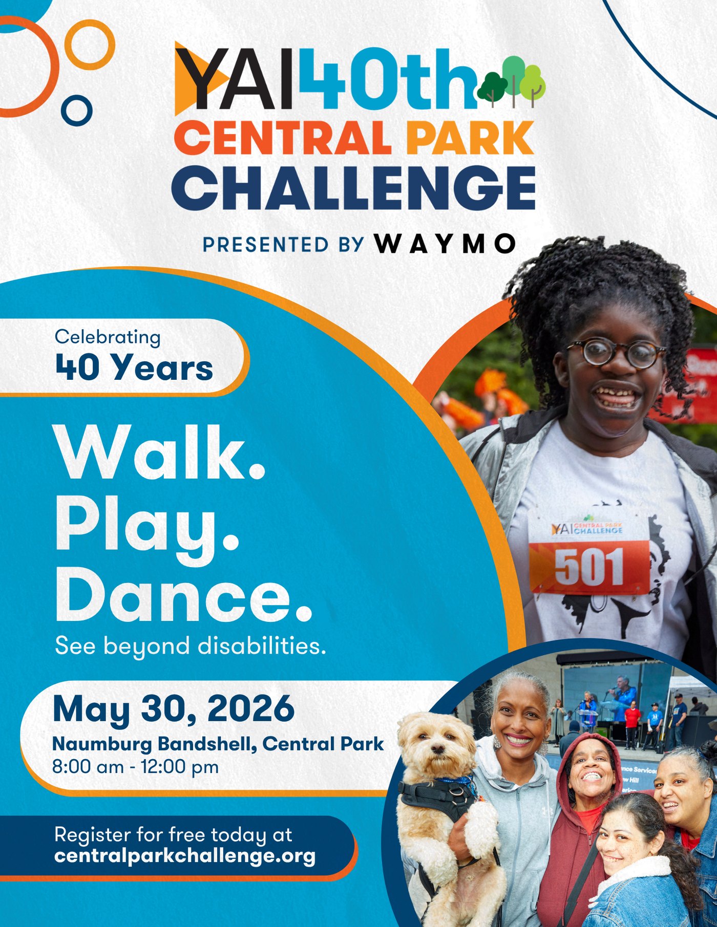
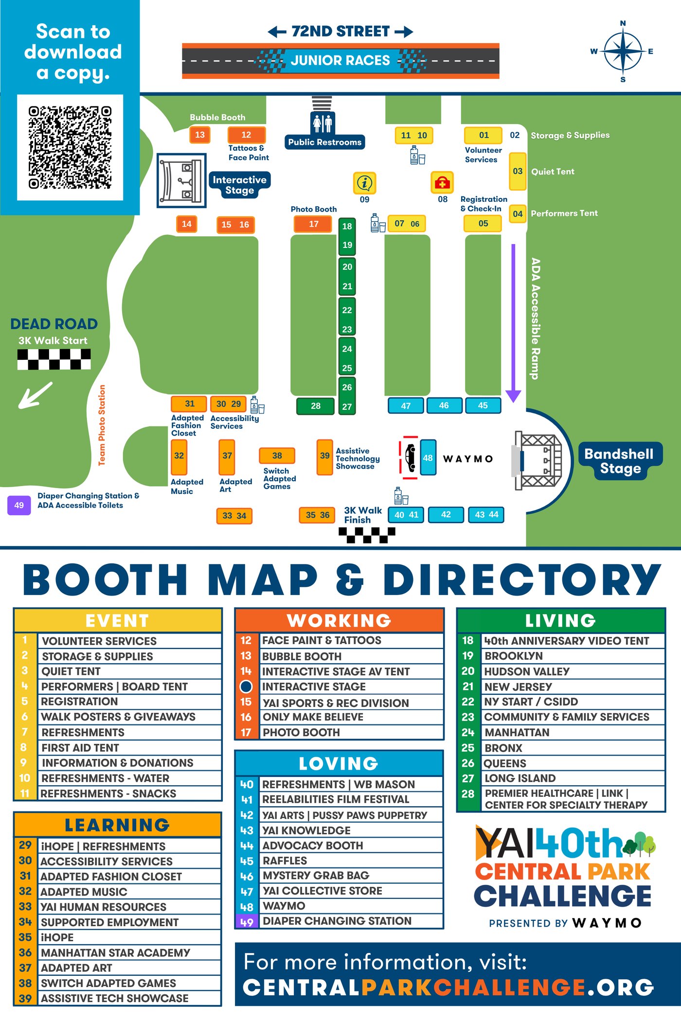
Central Park Challenge · 2026The poster puts the date, the place, and one call to action (free registration) on a single page, promoting a year with 4,424 registrants, up 12.7%. On the day, the booth map and directory groups 49 numbered locations into color-coded themes, with a QR code to download a copy, so attendees could find activities, restrooms, and the accessible ramp on their own.
On-site digital signage
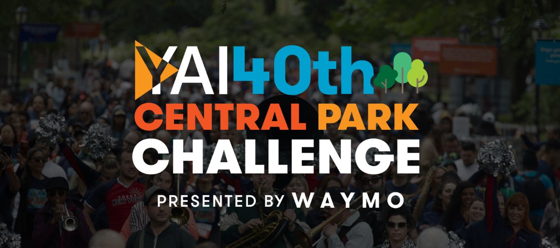
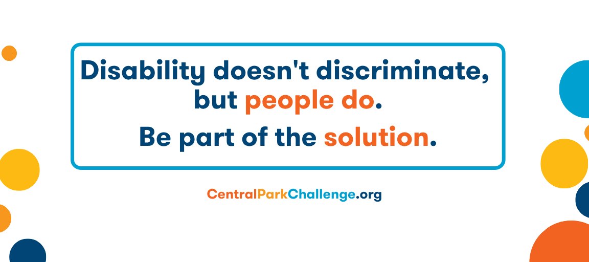
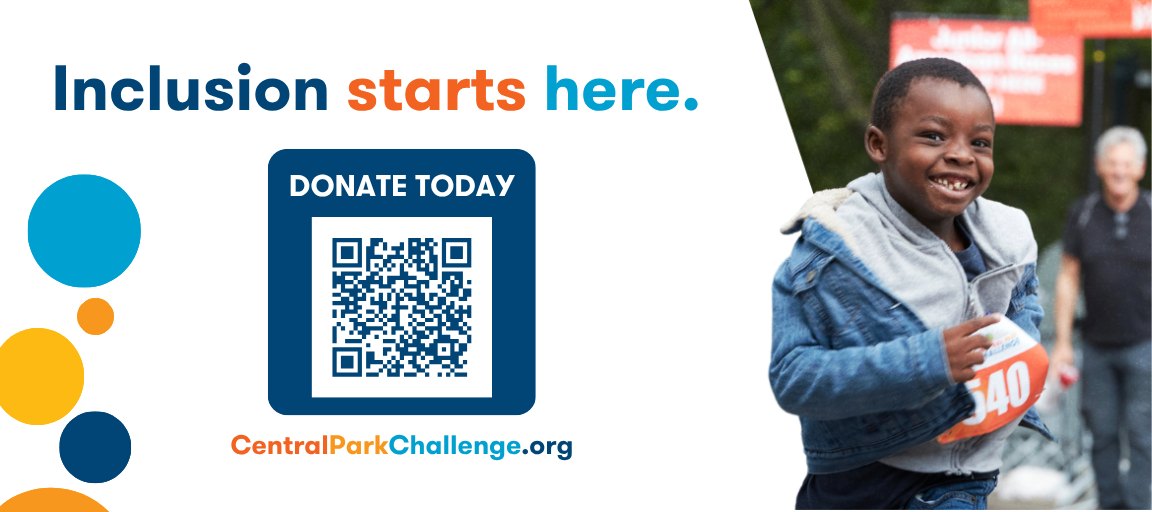
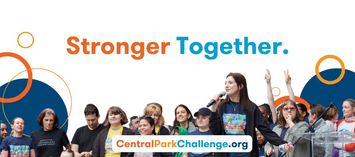
Central Park Challenge · 2026Looping on 10-foot-plus screens around the event, these designs carried the day's advocacy message and a donate QR code, so event-day attention could turn into gifts.
Large-format signage
Central Park Challenge · 2026The largest prints of the 40th: 3 × 6 ft photo towers carrying the anniversary branding, and a 15 ft bandshell banner, in five panels, thanking the event sponsors. I planned how the physical signage would look on site, making sure it stayed in line with the creative direction already established for the 40th anniversary celebration. Working with a graphic designer, I set the art direction and coordinated each piece from planning to event day.
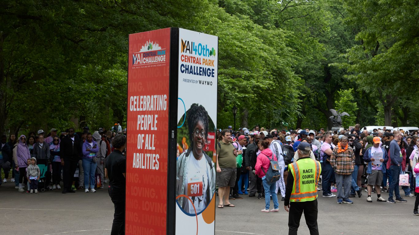
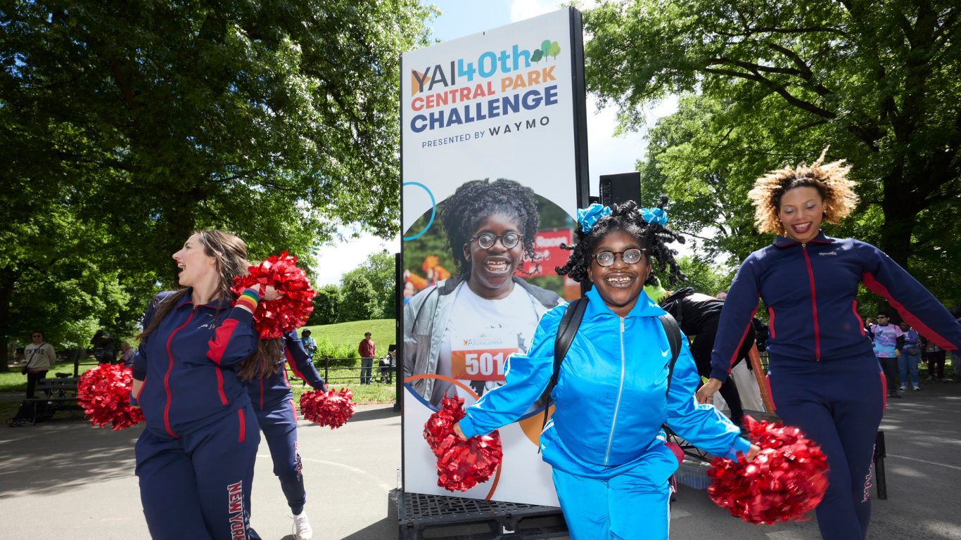
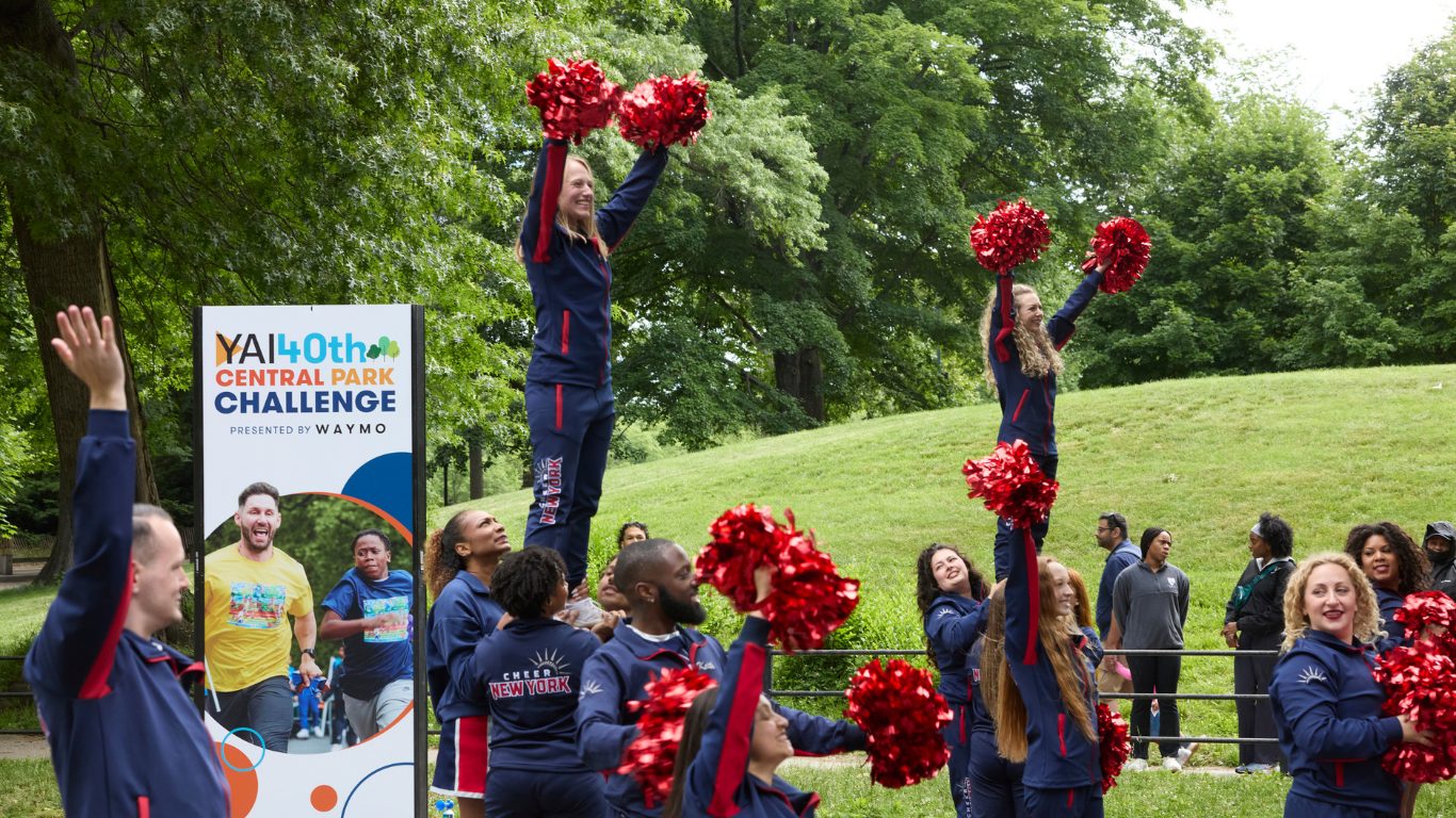
PlanningEach tower face is a 3 × 6 ft panel. Before any artwork, I mapped what it had to carry from across a lawn: the anniversary lockup and presenting sponsor at the top, one participant photo in the campaign circle, and the advocacy message on the side.
- 140th lockup up topSits above head height so it reads over a crowd.
- 2Presenting sponsor lineWaymo, the event's first presenting sponsor.
- 3Participant photo in a circleFour towers, four different participants.
- 4Rings & dotsThe campaign shapes break the photo edge.
- 5Advocacy sideRed panel: Celebrating people of all abilities.